
For this logo redesign I challenged myself to look at companies within the restaurant industry. Within that I looked at breakfast chains throughout the US as Canada. I chose the breakfast and lunch chain Cora, which is mainly found in eastern Canada and a very popular family brunch location.
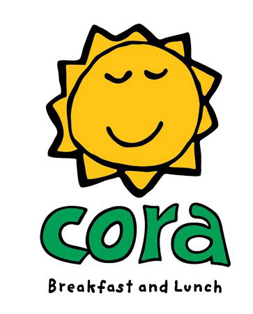
Current Logo
Looking at the current logo for Cora, there is not anything that ties it to being a breakfast chain other than the supporting text beneath. Without this context, it could be seen as a daycare or similar establishment.

Ideation
In this stage I began sketching potential logo options. The menu suggested they served a lot of eggs, crepes, pancakes, and waffles. These were things I wanted to incorporate into the new logo. I also wanted to ideate solutions that utilized aspects from the previous. logo such as sun rays and shapes.
Digital
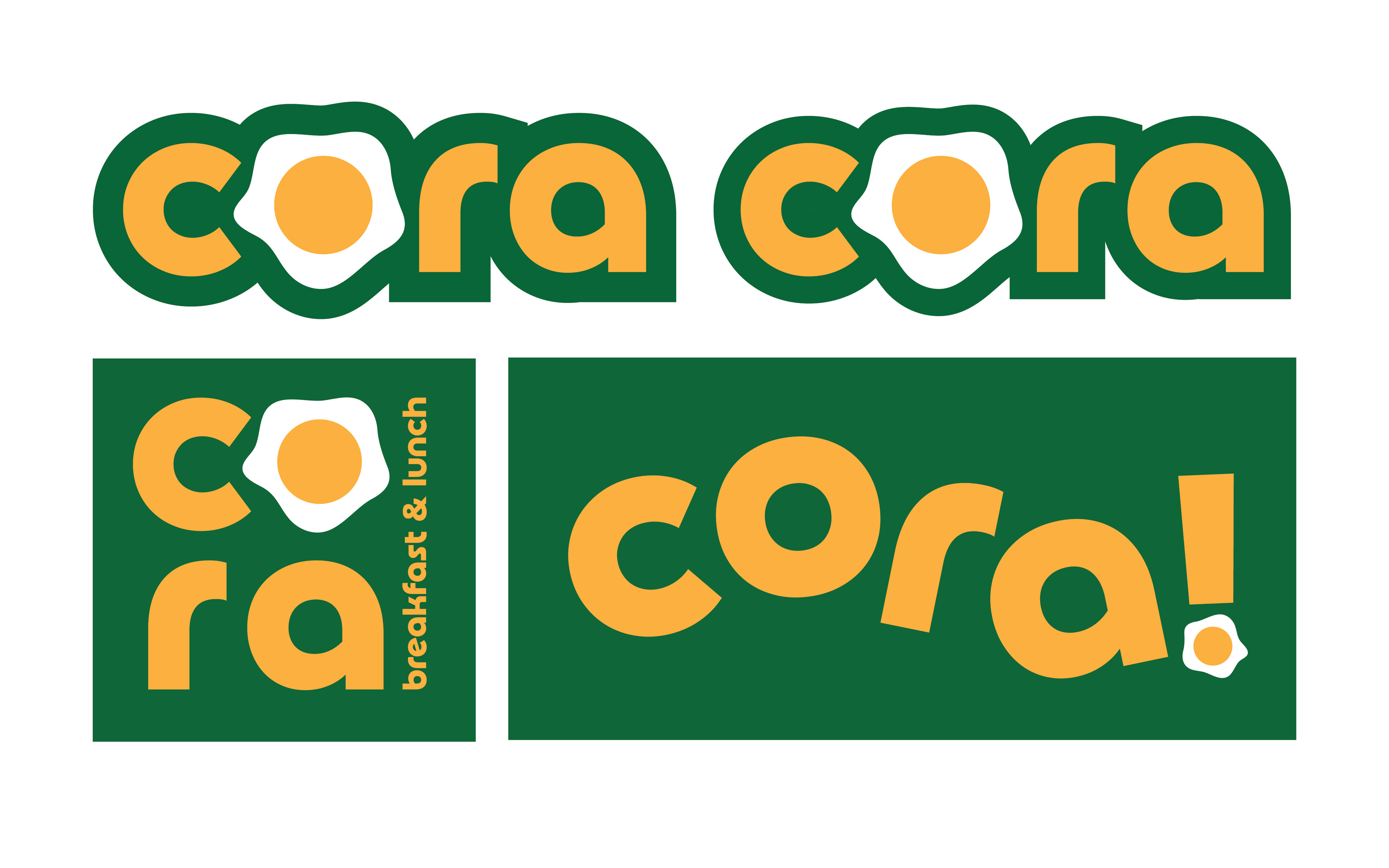
I then chose the most successful sketches to digitize. I utilized the same brand colors as the original branding, nut replaced the sun icon for an over easy egg to give the brand an instant connection with breakfast.
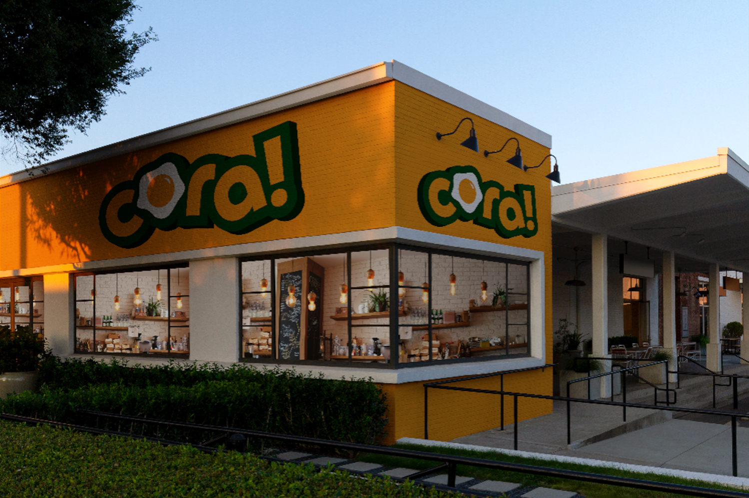
For the second round of iterations, I combined two of the potential logos from the first round to create a fun, energetic, breakfast oriented logo. The highlight on the egg provides a dimensionality within the logo and the tilted letters make it fun, whimsical and appealing to families.

Final + Implementation
After the logo was finalized, I created a uniform exterior store presence to create a cohesive Cora experience at every location across the franchise.
