Bliss Bites is a bite sized, mess-free granola clusters perfect for the busy individual.
These tasty treats are flavored after your favorite desserts while still being healthy. They are high in protein and fiber while tasting like strawberry cheesecake, key lime pie, and chocolate lava cake.
This product is targeted towards young individuals new to the professional landscape and college students who may be rushing around and don’t have lots of time to eat.
These people would eat Bliss Bites when they need a quick snack or boost of energy during the day.
This project was created by a team at FUTUREBRAND Syracuse and I worked with Michele Fu and Andrew Levesque.
Research
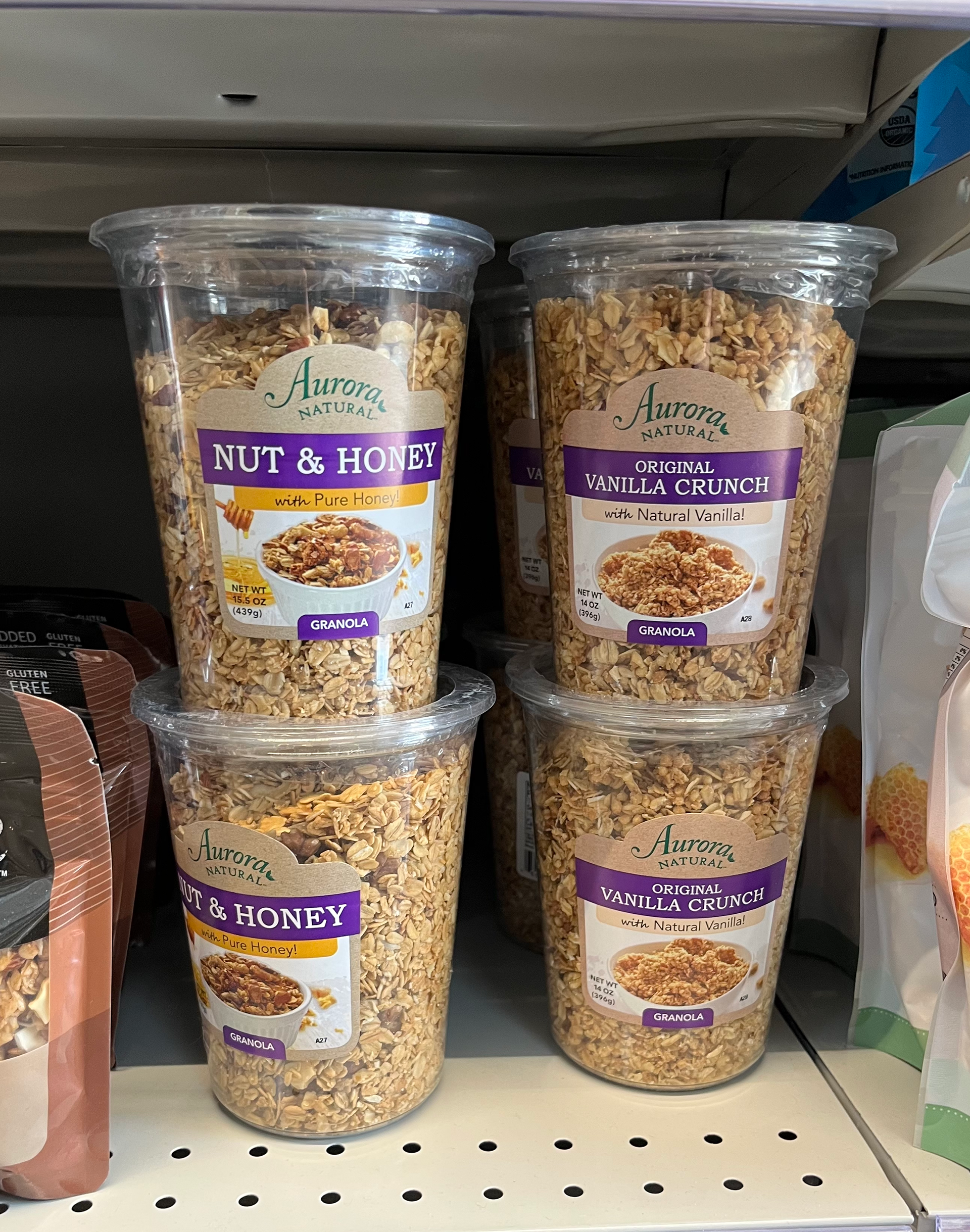
After extensive store audits at many stores (Wegmans, Target, Walmart, REI, Whole Foods, and Trader Joes) we found that generally loose granola is packaged in resealable pouches with windows. Granola bars and clusters are packaged in flexible film and paperboard. There are many organic options. And the most common flavor is chocolate.
Research through the Mintel Database showed that “Older consumers prioritize traditional health markers like high fiber and low sugar in cereals, while younger consumers have a more nuanced perception of health, associating cereals with added proteins and functional health benefits.” Also, "younger generations look for fun; older generations look for functional."
What stuck out to us was “Cereal consumers seek the ‘sweet spot’ between flavor, health and convenience” This led us to choose mess-free, bite-sized dessert granola as our product.


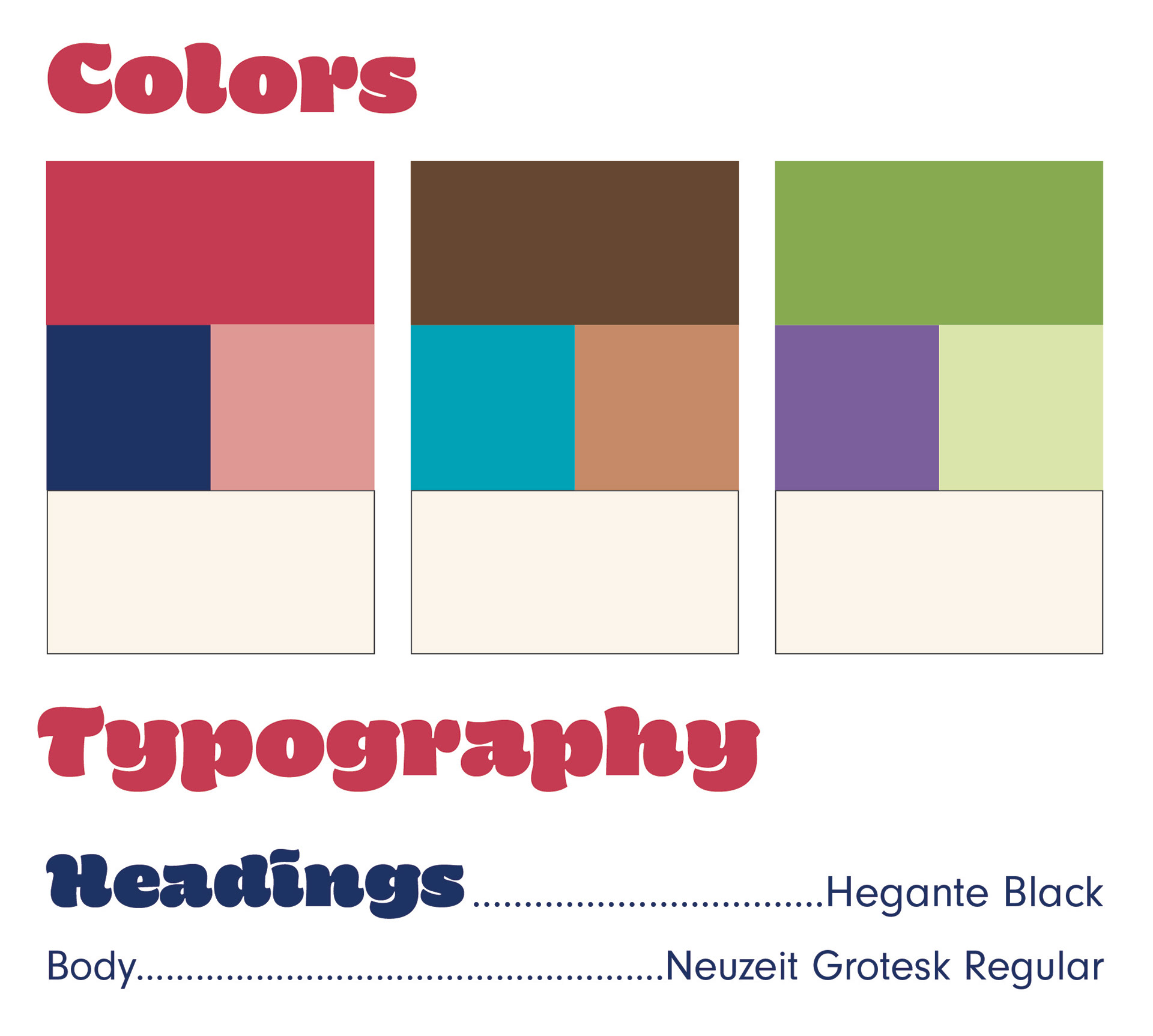
Branding
For the branding, we wanted to create something that was enticing to the consumer.
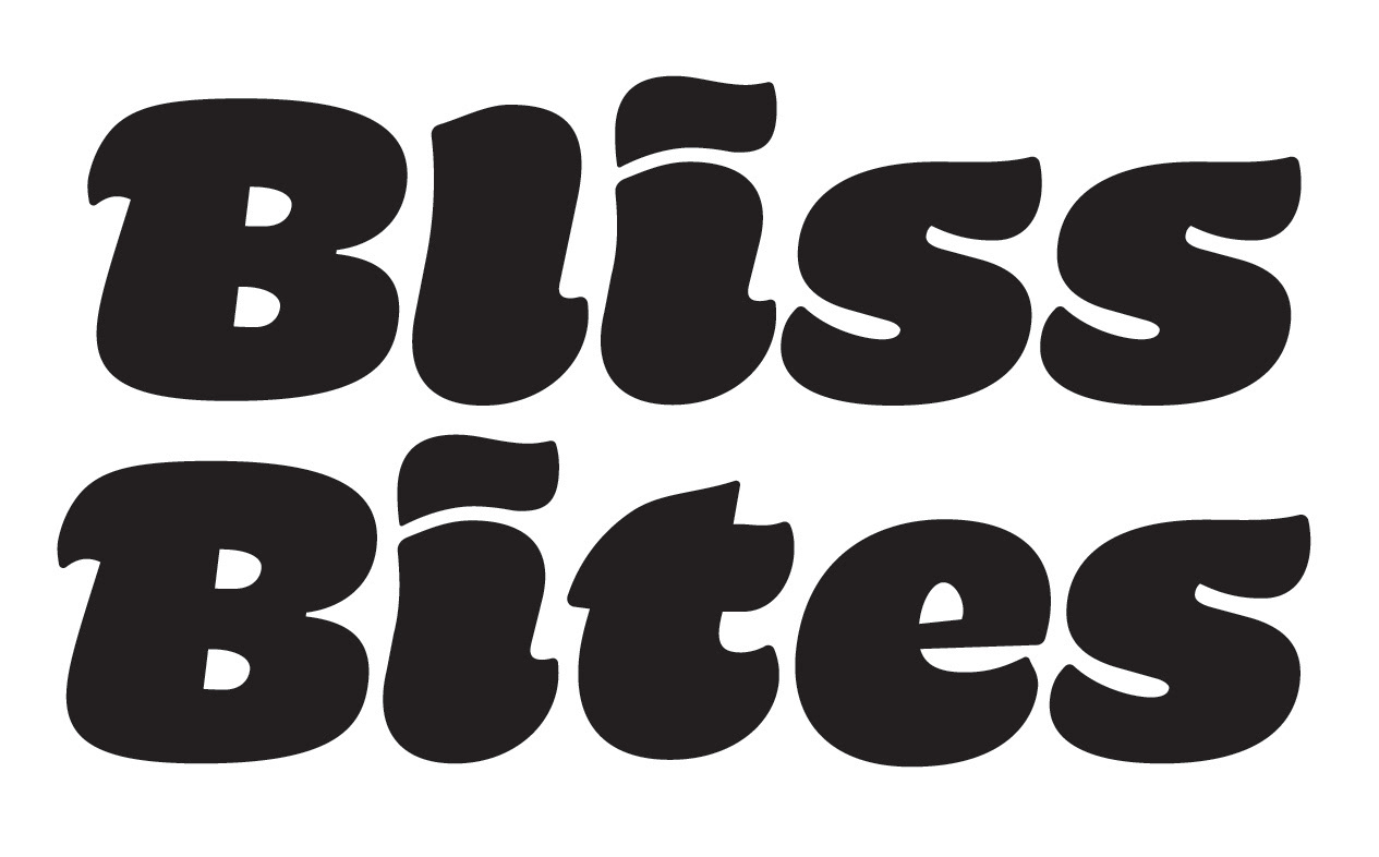
In the logo, the unique swooping letterforms personify a tasty dessert.
We attempted variations with nesting and secondary ornamentation, but it became very unbalanced and took away from the original letterform.
Logo and colors by Samantha Morgan
Colors by Samantha Morgan and Michelle Fu
Colors by Samantha Morgan and Michelle Fu
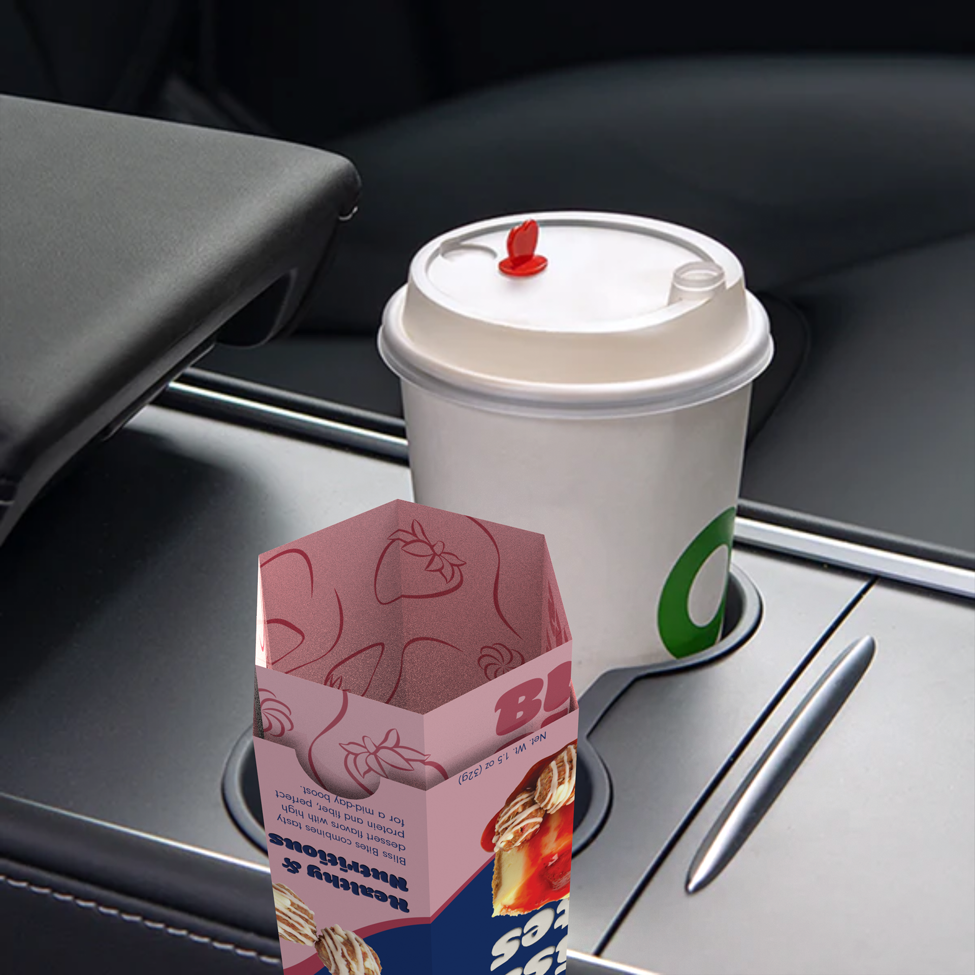
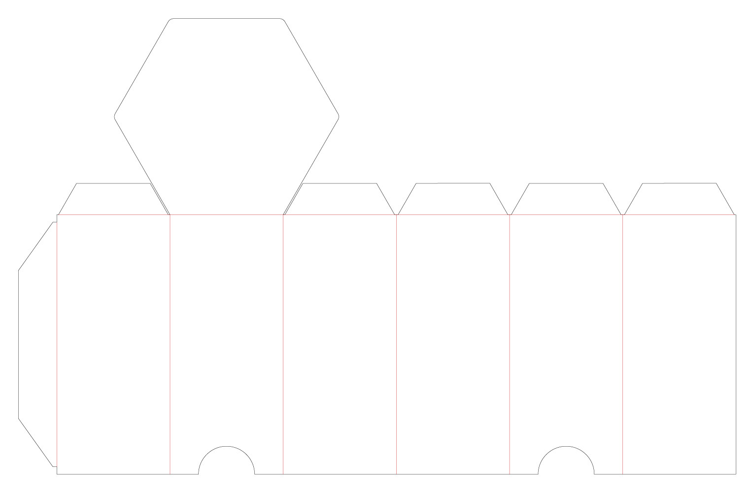
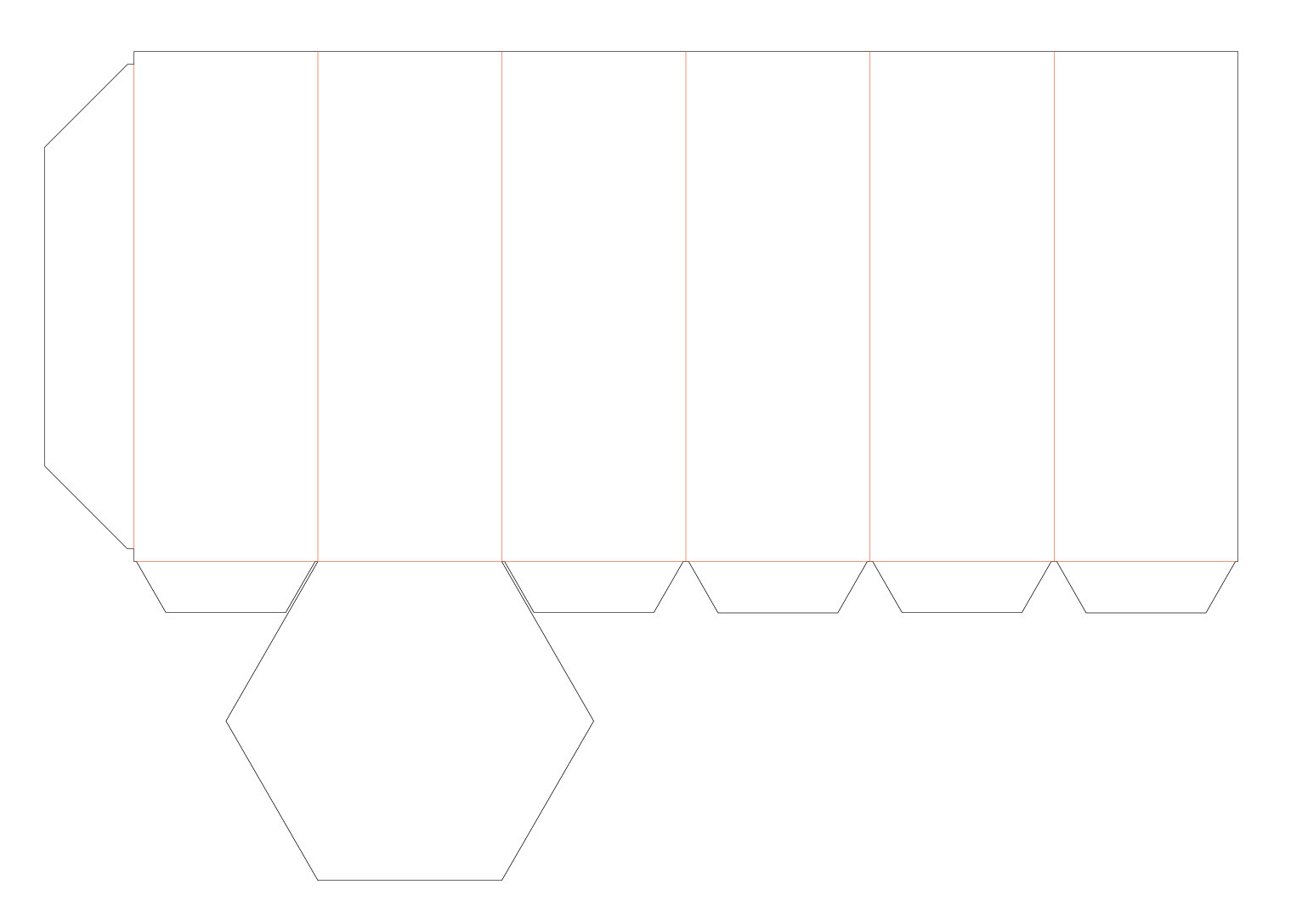
Packaging Structure
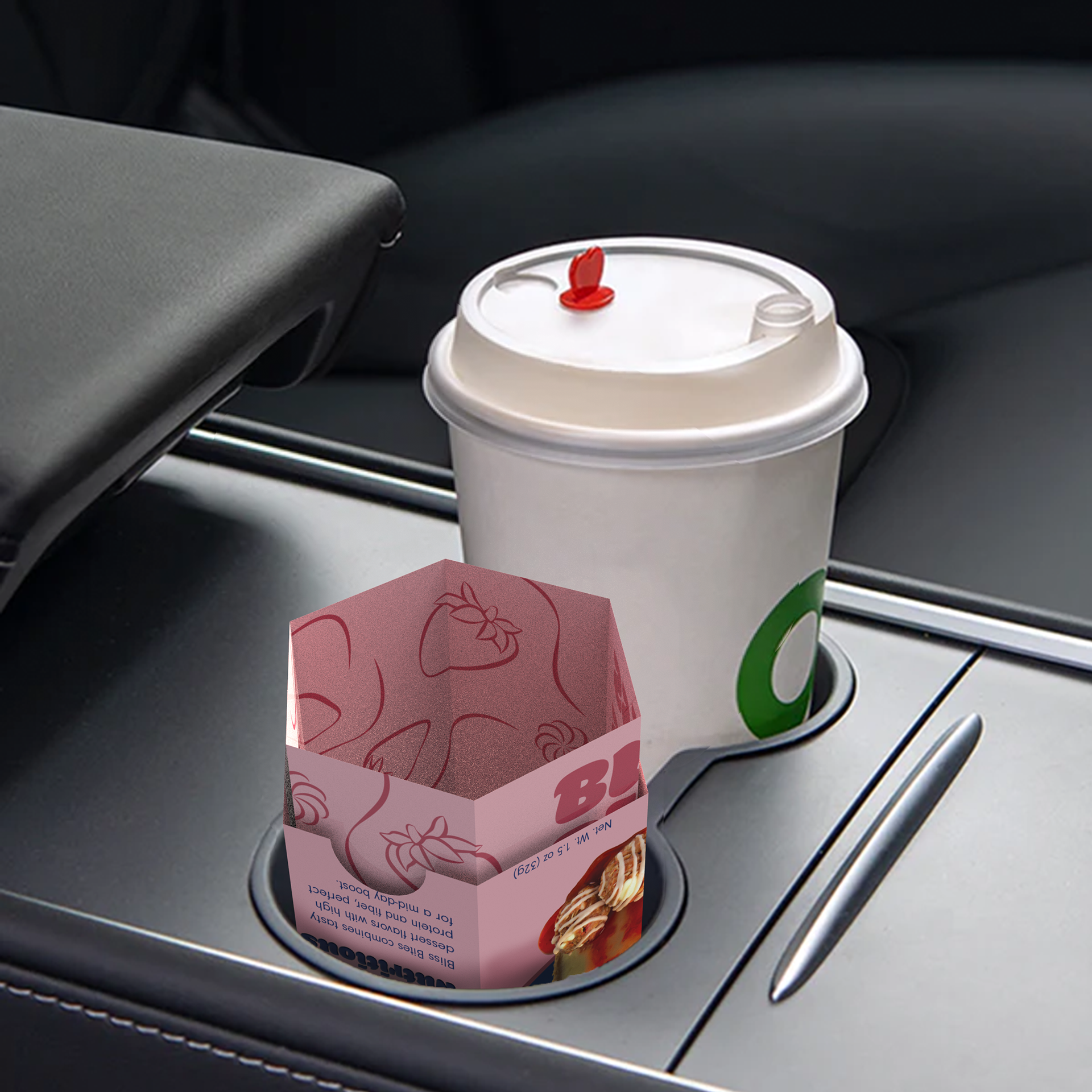
This product was designed to fit in the cupholder of a car for peak convenience and is very easy to grip if your snacking while you walk.
The exterior (top) part has two cut outs to make it easy to grip the interior (bottom) and open the product. The package is sealed through a friction lock and has a food safe coating to keep the food inside fresh.
Designed by Andrew Levesque
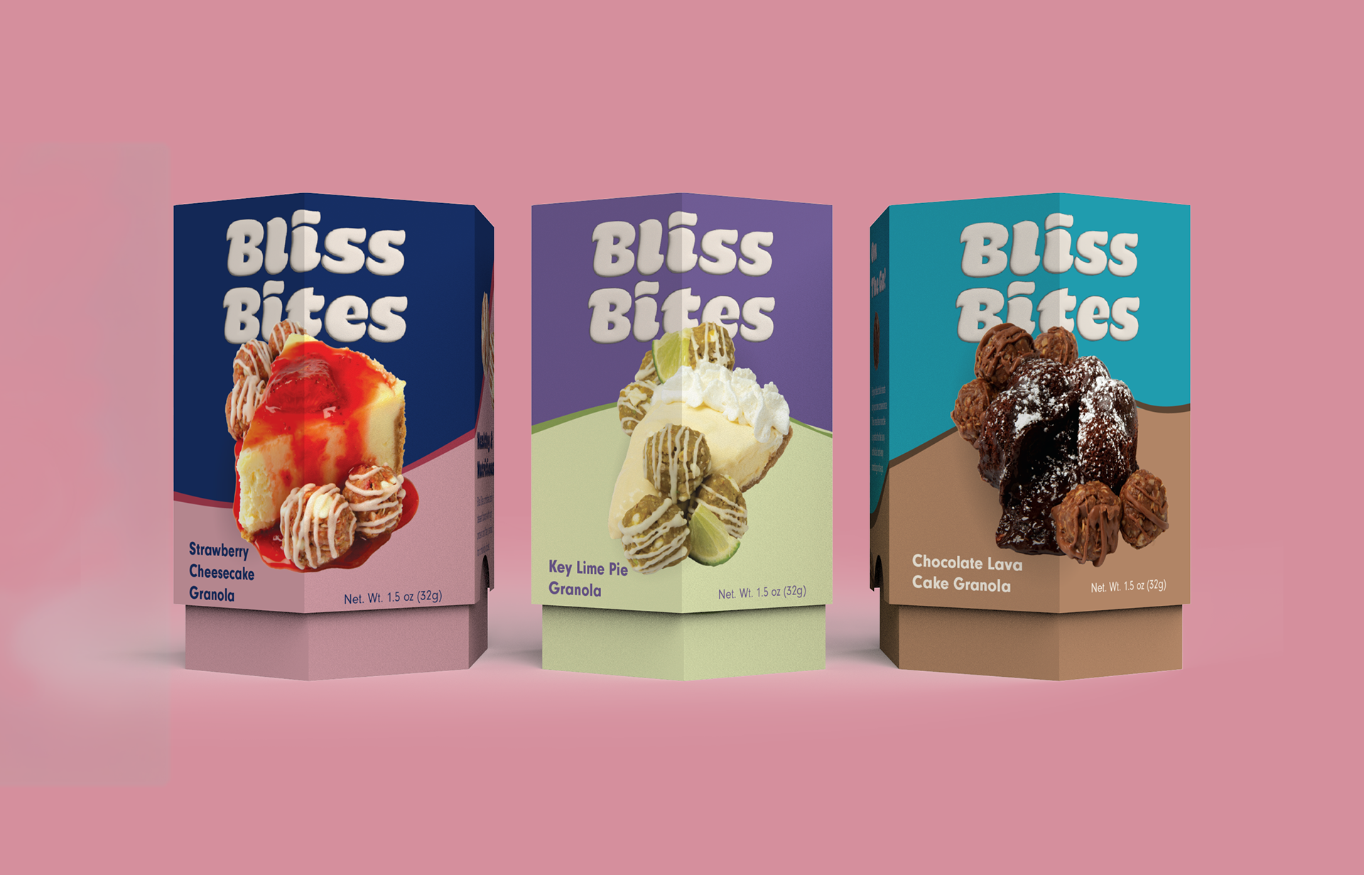
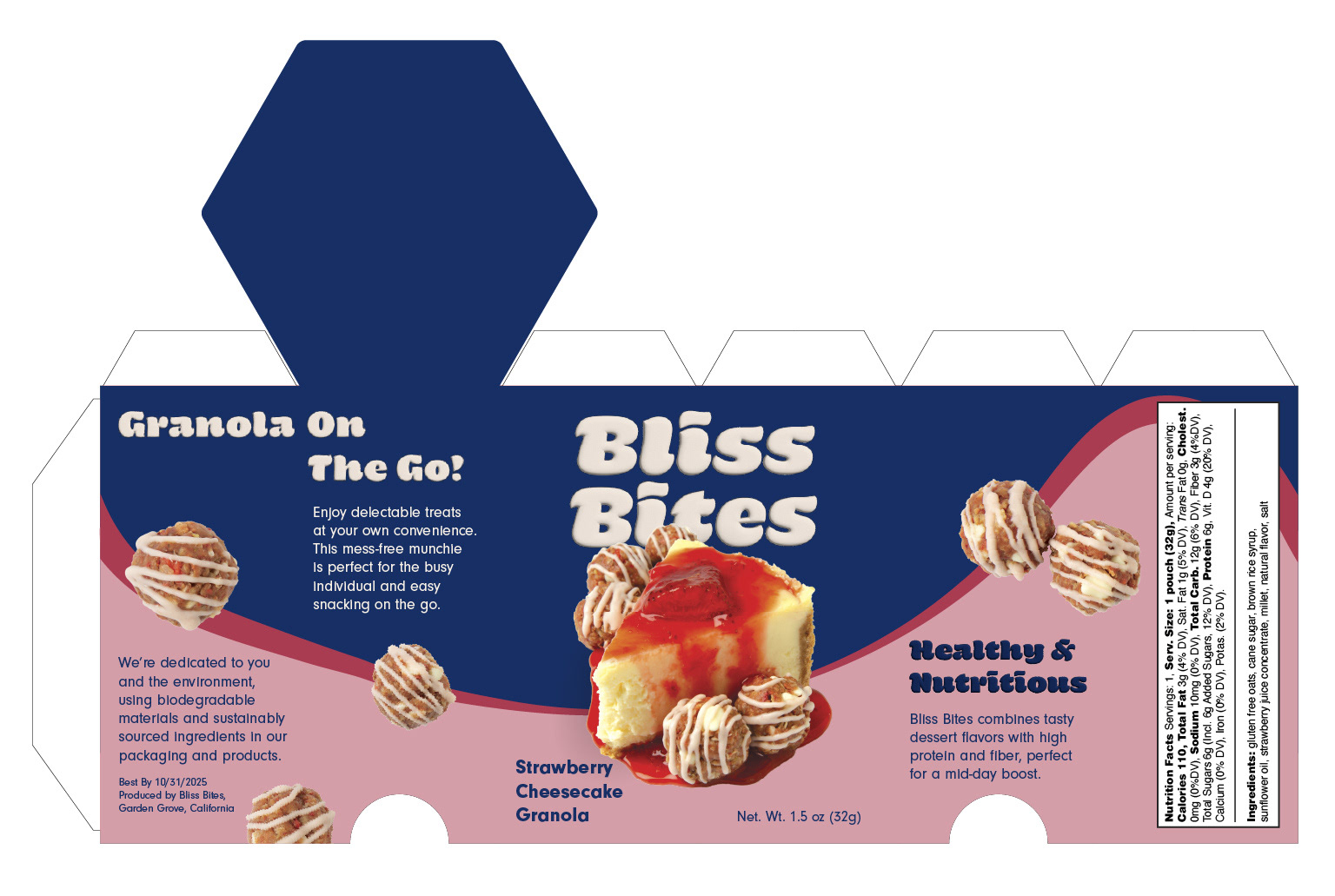
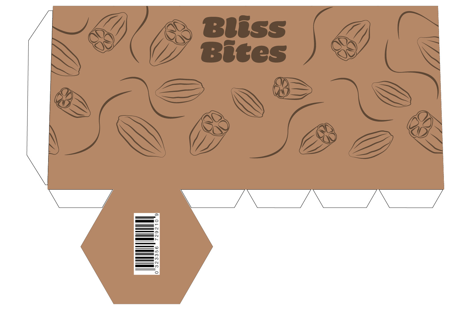
Packaging Design
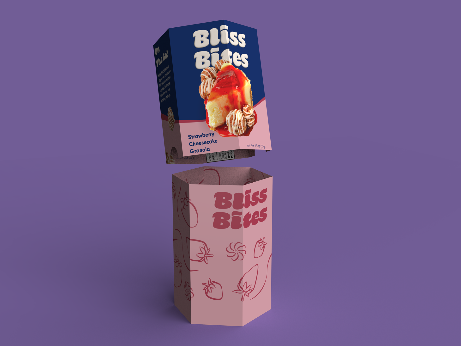
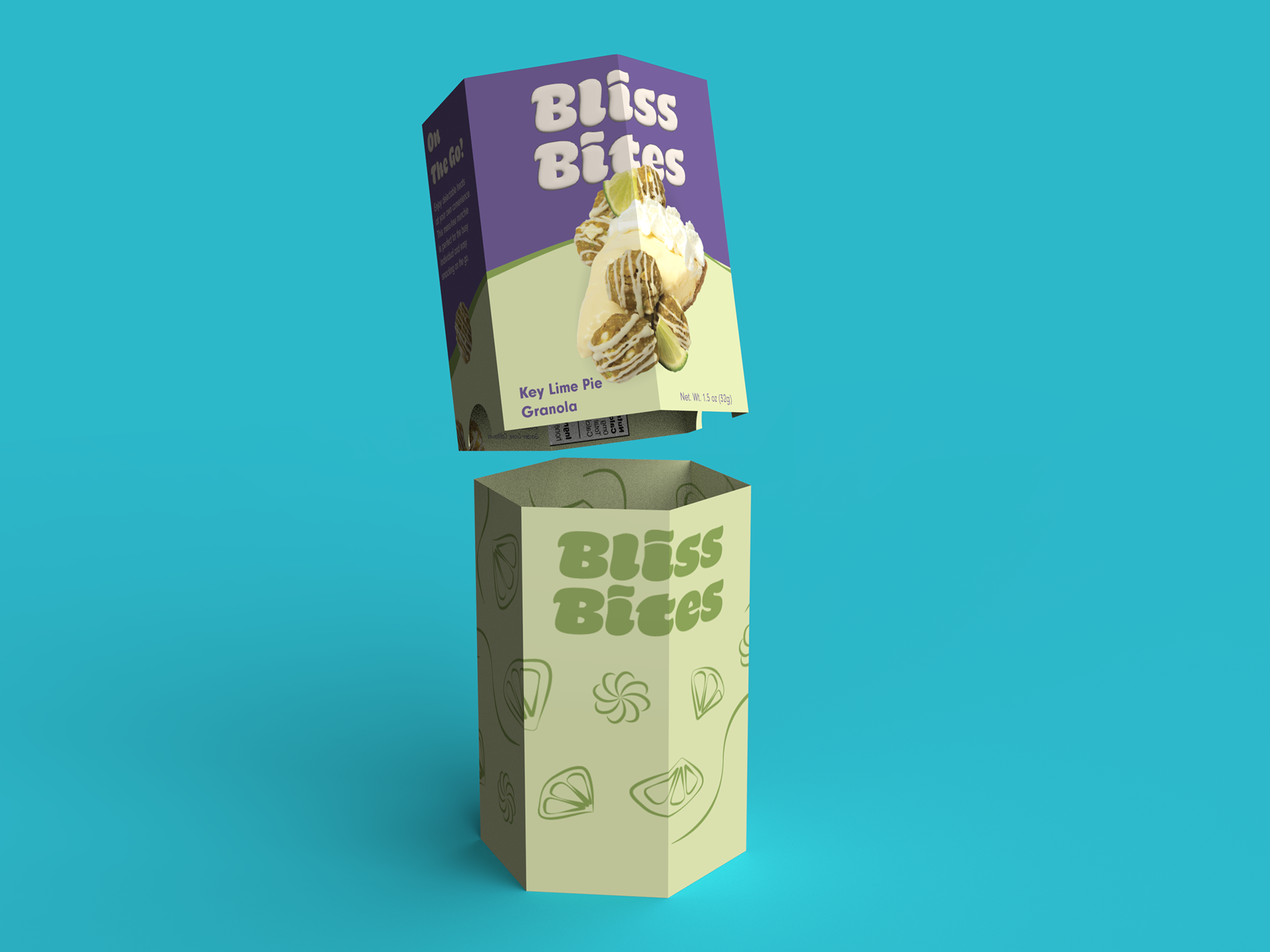
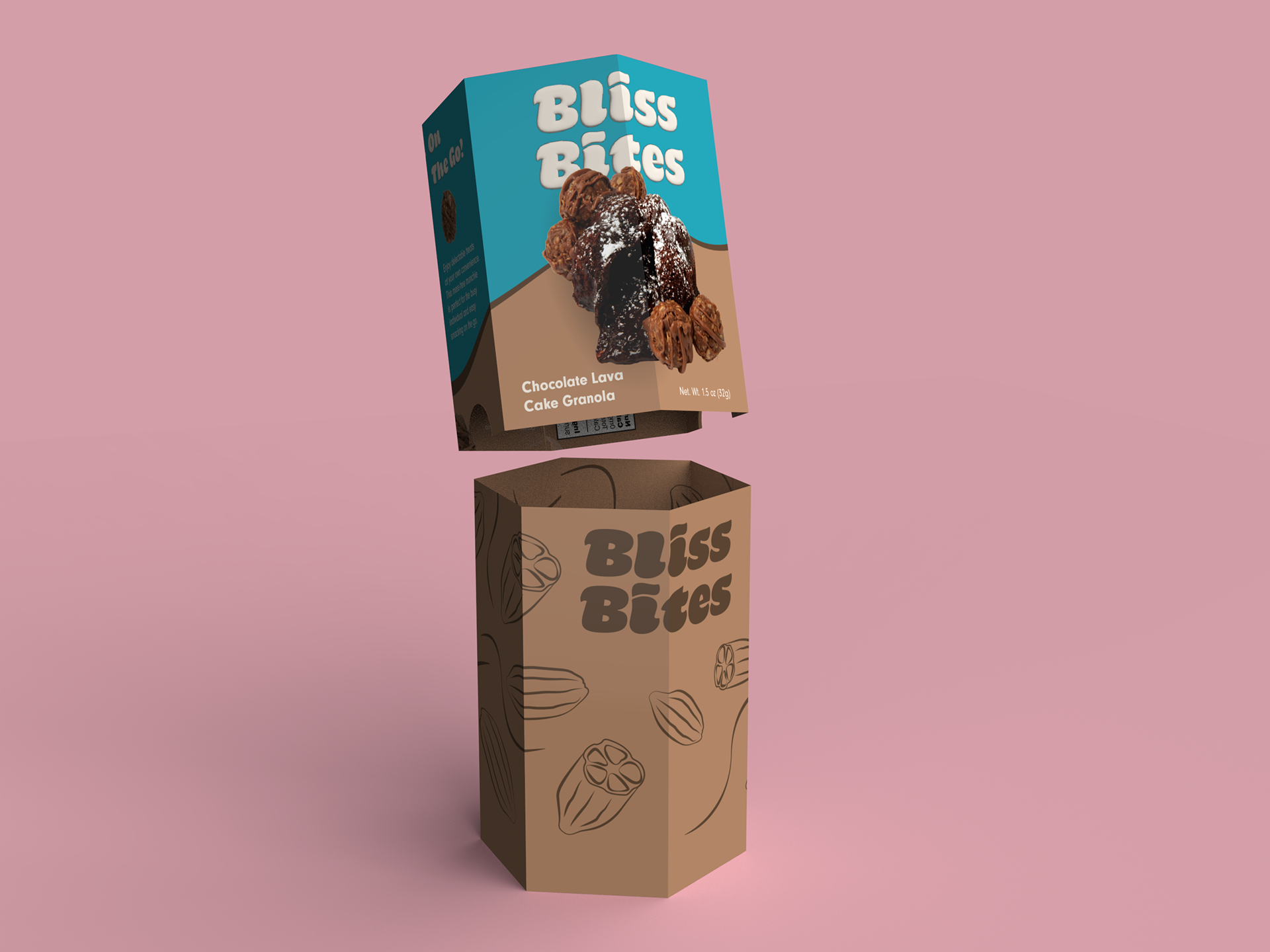
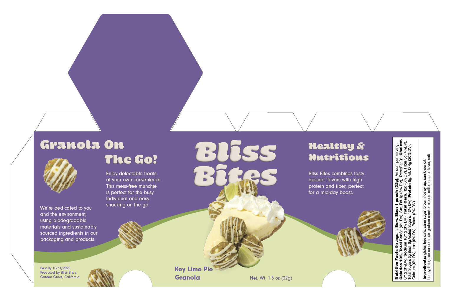
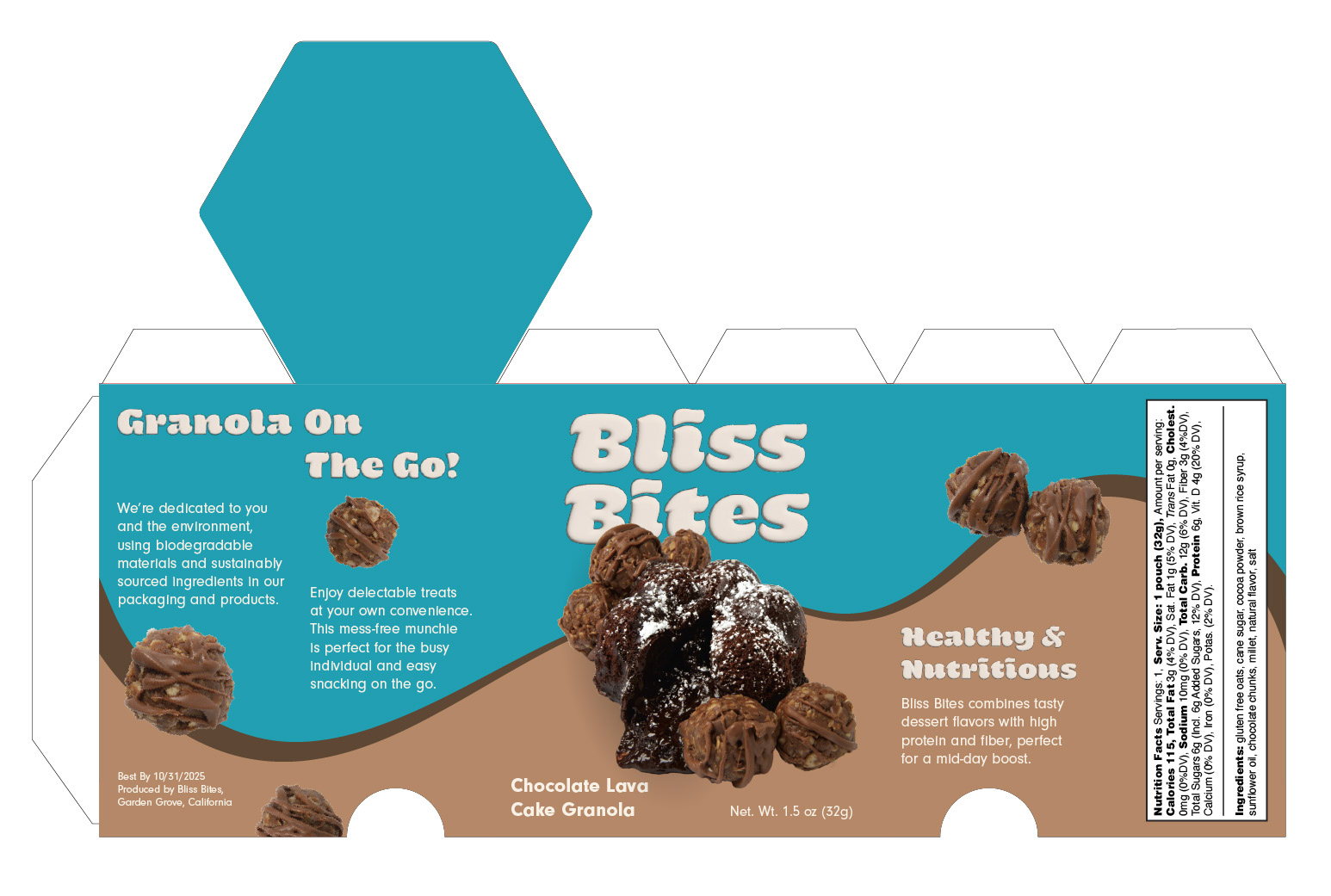
With such a decadent dessert, we needed to create a package that resembled it. The color blocked background creates a foreground and background within the design and the swooping line adds indulgent characteristics thought variable weights.
The real product photography has an appetite appeal that attracts customers and entices them to purchase.
The granola photos create dimensionality, appetite appeal, and a visual path to follow throughout the package. The package also points out the on the go capabilities and heathy qualities within.
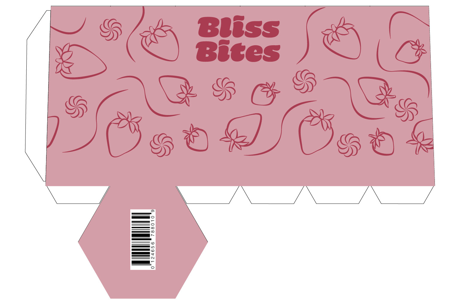
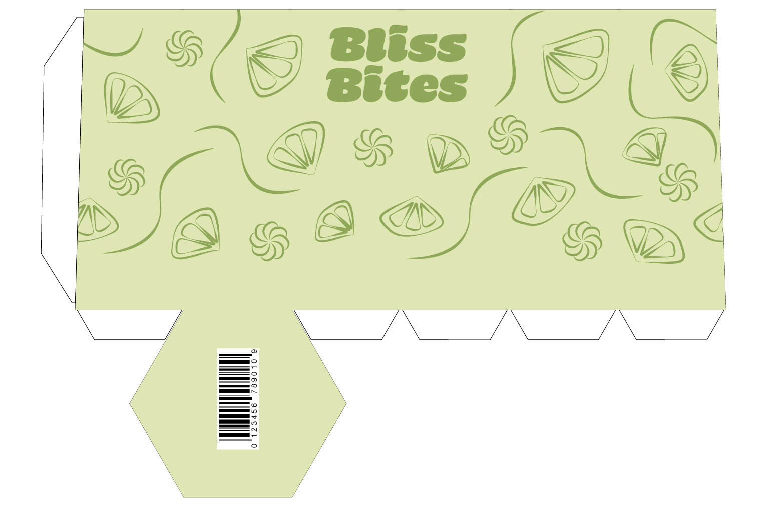
The interior packaging showcases a pattern specific to each product. It is reminiscent of the flavor of each SKU. When you open the package you're surprised by a fun design that shows the branding in a subtle way.
Photography by Jolie Greco
Exterior Packaging by Samantha Morgan
Interior Packaging by Michelle Fu
Exterior Packaging by Samantha Morgan
Interior Packaging by Michelle Fu
Final Renders